
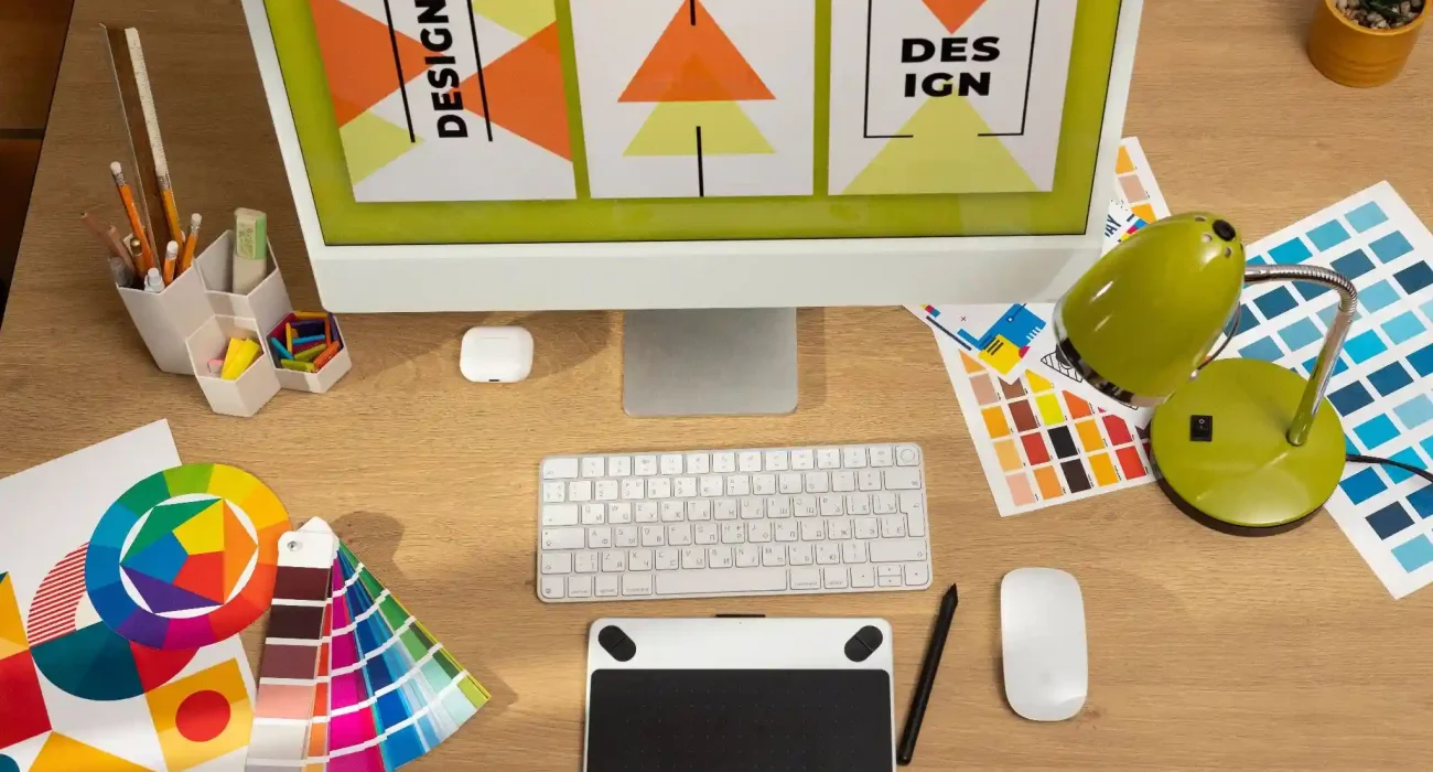
Visual design is an essential aspect of graphic communication. It influences how messages are conveyed and received. Mastering the principles of visual design is crucial for creating compelling graphics that communicate effectively. This blog post will explore advanced insights and practical strategies that can help you elevate your design work. Whether you are a seasoned designer or looking to deepen your existing knowledge, this guide will provide valuable insights.
Advanced Visual Design Principles
Exploring Balance Beyond Basics
Balance is foundational in visual design. It can be categorized into two main types: symmetrical and asymmetrical. Symmetrical balance creates a sense of harmony. It is often used in formal designs. Asymmetrical balance, on the other hand, offers a dynamic feel, allowing for more creativity. To effectively use balance, consider the visual weight of elements. For instance, larger shapes will carry more weight than smaller ones. This principle is crucial when designing layouts that require a natural flow. A well-balanced design draws the viewer’s eye across the composition.
Case studies from renowned design projects highlight how balance enhances visual appeal. For example, the design of the Apple homepage employs asymmetrical balance. This technique creates an engaging experience while maintaining a clean look. The strategic placement of elements leads to effective communication.
Deep Dive into Contrast
Contrast is another critical principle in visual design. It can be achieved through color, size, shape, and texture. Effective contrast guides the viewer’s attention to key elements. It creates visual interest and enhances readability. To maximize contrast, use complementary colors. For instance, pairing dark text on a light background improves legibility. In graphic design, contrast can also emphasize important information. For example, using a bold font for headings against a lighter body text can create a clear hierarchy.
Analyzing successful designs showcases the power of contrast. The “Just Do It” campaign by Nike exemplifies this principle. The stark contrast between the bold logo and the minimal background makes the message stand out. This approach ensures that the viewer’s focus remains on the core message.
Optimization Techniques for Design Efficiency
Advanced Workflow Strategies
Efficiency in design is crucial for meeting deadlines and maintaining creativity. Implementing advanced workflow strategies can greatly enhance productivity. One effective approach is adopting agile methodologies. This allows for flexibility and adaptability in design projects.
Using design sprints can streamline the process. Define your goals, establish a timeline, and focus on rapid prototyping. This method encourages experimentation and quick iterations. It enables designers to explore multiple ideas without getting stuck.
Additionally, consider tools that automate repetitive tasks. Software like Adobe Creative Cloud offers features that save time. Automation can reduce the mundane aspects of design, allowing you to focus on creativity.
Customizing Templates for Unique Brand Identity
Templates can be powerful tools for maintaining consistency. However, customization is key to ensuring originality. Start by analyzing existing templates. Identify areas where you can inject your brand’s personality. Creating a comprehensive style guide is essential. This guide should outline your brand’s colors, fonts, and visual elements. It serves as a reference point for all design projects. Customizing templates based on this guide ensures that every piece aligns with your brand identity.
Practical tips include using unique imagery and adjusting layouts. This approach helps differentiate your work while still benefiting from the efficiency of templates. Remember, templates should serve as a foundation, not a crutch.
Enhancing Communication Through Typography
Advanced Typography Techniques
Typography is a crucial element in visual design. The choice of typeface can significantly impact the viewer’s perception. When selecting fonts, consider their legibility and emotional resonance. Combining fonts effectively is an art. Use a primary font for headings and a complementary one for body text. This combination creates a visual hierarchy. Hierarchy guides the viewer through the content, making it more digestible.
Best practices for typography include using a limited number of fonts. Stick to two or three typefaces to maintain cohesion. Additionally, pay attention to spacing. Proper kerning and leading enhance readability.
Integrating Typography with Visual Elements
Effective integration of typography with visual elements is essential. This approach creates a cohesive design that captures attention. Consider how text interacts with images. The key is to ensure that neither element overshadows the other. Use overlays to harmonize typography with visuals. For instance, placing text on an image can create a striking effect. Ensure that the text remains legible by using contrasting colors.
Analyzing successful campaigns can provide insights into this integration. The “Share a Coke” campaign by Coca-Cola effectively combined typography with imagery. The personalized names on bottles engaged consumers while reinforcing brand identity.
The Strategic Use of White Space
Maximizing Impact with White Space
White space, or negative space, is often underestimated. However, it plays a vital role in enhancing design clarity. Effective use of white space can create a sense of elegance and sophistication.
Techniques for maximizing white space include strategic placement of elements. Avoid clutter by allowing breathing room around important content. This approach enhances focus and guides the viewer’s eye.
Analyzing designs that utilize white space effectively reveals its power. The minimalist website of Google exemplifies this principle. The ample white space allows users to navigate effortlessly, keeping the focus on search functionality.
Balancing Content and White Space
Finding the right balance between content and white space is crucial. Too much content can overwhelm the viewer. Conversely, excessive white space can make a design feel sparse. Striking the right balance enhances user experience.
Evaluate the purpose of each element in your design. Ask yourself if it contributes to the overall message. If not, consider removing it. This approach simplifies the design while maintaining its effectiveness.
The role of white space in modern aesthetics cannot be overlooked. Brands like Apple thrive on minimalist designs that emphasize white space. This strategy reflects sophistication and clarity, resonating with their target audience.
Continuous Improvement Strategies for Designers
Staying Ahead with Design Trends
The design landscape is constantly evolving. To remain competitive, staying updated with trends is essential. Follow industry leaders and participate in design forums. Engaging with the community keeps your skills sharp and exposes you to new ideas. Resources for accessing cutting-edge design trends include online platforms and design blogs. Websites like Behance and Dribbble showcase innovative projects. These platforms can inspire your work and spark creativity.
Additionally, attending design conferences can provide valuable insights. Networking with peers and industry experts fosters collaboration and growth. Embrace change and be open to experimenting with new techniques.
Building a Feedback Loop
Constructive feedback is invaluable for personal and professional growth. Establish a structured feedback process within your team. Regular check-ins and critiques can provide fresh perspectives on your work.
When seeking feedback, be specific about what you want to improve. This clarity helps others provide targeted insights. Additionally, embrace criticism as an opportunity to learn and refine your skills. Iterative design is a powerful approach. Incorporate feedback into your revisions and assess the outcomes. This iterative process leads to continuous improvement and fosters innovation.
Real-World Applications of Visual Design Principles
Analyzing Successful Campaigns
Examining successful design campaigns offers practical insights. Analyze how top brands effectively apply visual design principles. Look for commonalities in their approach and execution.
One notable example is the Airbnb branding campaign. The use of vibrant colors and engaging imagery creates an inviting atmosphere. Their consistent application of design principles enhances brand recognition.
Learning from these campaigns can inform your future projects. Identify elements that resonate with your audience and adapt them to your style. This analysis can lead to more impactful and memorable designs.
Common Pitfalls in Advanced Design
Experienced designers are not immune to mistakes. Recognizing common pitfalls can help you avoid them. One frequent issue is overcomplicating designs. Simplicity often leads to clarity and effectiveness.
Another common mistake is neglecting user experience. Always consider how your design impacts the viewer. A design might look great, but if it’s not functional, it fails to communicate effectively. Tips for avoiding these pitfalls include conducting usability tests. Gather feedback from real users to identify areas for improvement. This proactive approach ensures that your designs are both visually stunning and user-friendly.
Conclusion
Mastering visual design principles is essential for effective graphic communication. By exploring advanced insights and practical strategies, you can elevate your design work. Focus on optimization, efficiency, and continuous improvement.
Embrace the principles discussed in this blog post. Apply them to your projects to create compelling and impactful graphics. The world of design is ever-evolving, and staying informed will keep your skills sharp.
FAQs
1. What are the key advanced visual design principles?
Key advanced principles include balance, contrast, typography, white space, and user experience optimization.
2. How can I improve my typography skills in design?
Focus on font pairing, hierarchy, and spacing to enhance readability and aesthetic appeal in your designs.
3. What is the role of white space in visual communication?
White space enhances clarity and focus, allowing important elements to stand out and improving overall user experience.
4. How can I stay updated with design trends?
Follow industry leaders, engage in design forums, and explore platforms like Behance and Dribbble for inspiration.
5. What are common pitfalls that experienced designers should avoid?
Common pitfalls include overcomplicating designs, neglecting user experience, and failing to seek constructive feedback.